Fairy Tale Camp Visual Development
MY ROLES
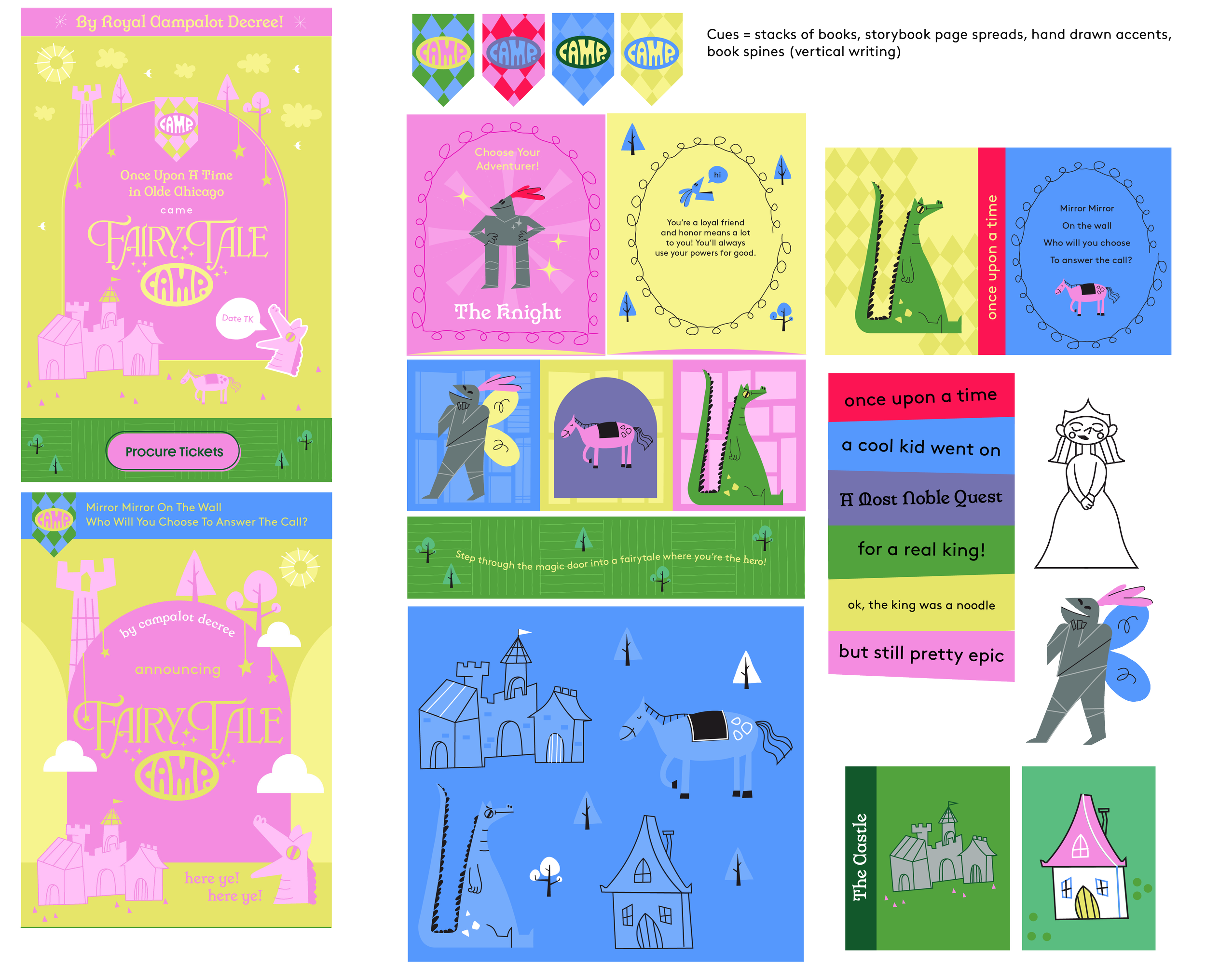
Visual Direction: I presented several different design systems for review based on the ever-changing needs of this show. I really had to stretch my visual development muscles for this ask, which is what I’ll focus on displaying.
Design Lead: I executed the design language across social, web, and print promotional and marketing materials.
Project Duration: 3 months
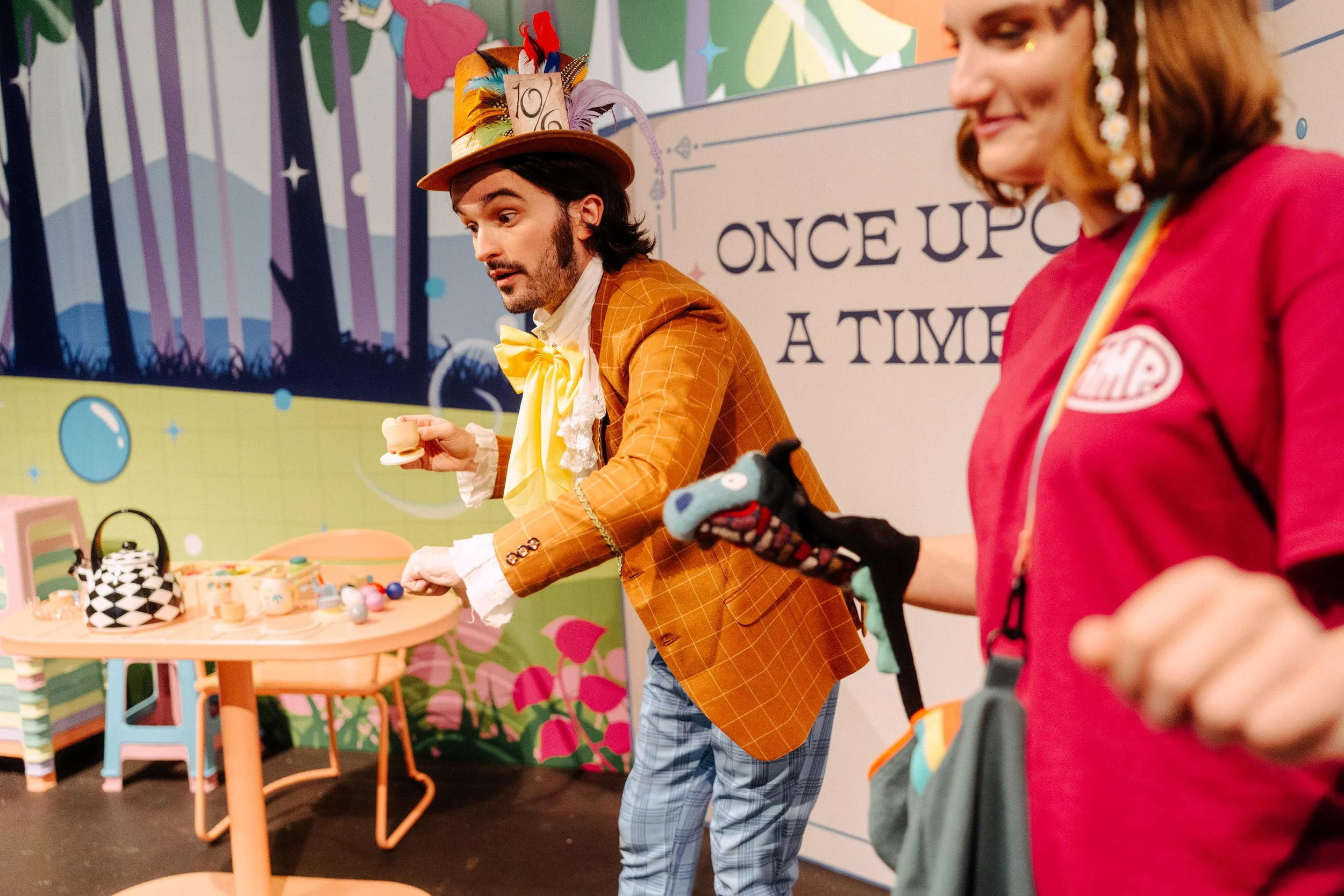
CAMP was developing a new experiential show called Fairy Tale Camp. This was a unique challenge because the team was developing the experience as we were creating the look and feel around it. It began as one concept but ended as an entirely different concept and the design and visual development followed suite. This meant that I needed to be on my toes, creating new and varied approaches to the visual development of the show as it happened. I started with merely the logo, which quickly stuck, but then had to create new visual languages around it as I continued to create alongside the experiential team.
CLIENT
CAMP is a retail-experiential children’s store that hosts and builds small scale experiential shows in each of its stores as well as sells (excellent) children’s toys in its retail section. It specializes in silliness and magic.
Show Creative Director: Arik Lubkin
Copyright CAMP, 2025
As the show was in an ever-changing development based on the narrative changing or the materials changing, as a team we had to pivot several times on style. As a solution, over a few months, I developed and presented several stylistic options for the team to look at to see what felt best with their current vision of the show. I presented one that was a RenFair approach that emphasized folkish dragons and characters as well as pennants, one that took a comic, bold, and graphic approach, and two that were based more on midcentury illustrations of storybooks. I had developed a logo beforehand that everyone wanted to keep, so the challenge was also making sure that the logo could be adaptable to any one of these styles.
The team ended up really gravitating towards the two midcentury pitches and asked me to combine them as the second round of brand development. I presented this development next.
They liked it quite a bit, but the experience narrative itself was changing again and we had to pivot again, so they asked me to explore the more comic-book like graphic approach I’d presented previously. The show had a giant looking for a lost sandwich, a dragon, Humpty Dumpty, and several other wacky characters they were tying into the experience, so I developed some rough ideas around what they were developing narratively.
We were much closer, but then the narrative changed quite drastically to using actual characters from fairytales guiding the experience alongside a goofy dragon and a silly goose character, so I needed to go back and develop so more show specific pieces and tighten up the visuals around them. Finally, I finished development nearly alongside the premier of the show. It was quite a challenge! But a good exercise on style that was very fun to explore.