BLUEY x CAMP Immersive Experience
MY ROLES
Design: Co-branding visual development for digital and print customer facing brand
Design: Execution, 360 style Print and Digital Promotional Marketing Materials including Vinyl installation
Design: Execution, Print Experience Materials
Go through the Magic Door hidden in CAMP Toy Stores and you’ll often find a magical world waiting for you! At CAMP LA, we put together Bluey Camp. Wackadoo! A small but essential team put this whole experience together to create a real cartoon world for families to enjoy. Let’s look at the experience together!
All official Camp x Bluey photography by Hope Glassel. All official Camp x Bluey videography by Hunter Bermudez. Copyright CAMP and BBC LUDO, 2024.

The Bluey x CAMP Experience: Enter Through the Magic Door
We can go through Bluey’s house and even meet the sisters!
Go ahead and click through the gallery to feel the experience unfold.

What’s behind the magic door?

Bluey and Bingo are hiding somewhere in the house!

We get to see the real thing


We can even sit at the kitchen table

We even get a meet and greet with Bluey and Bingo at the end, wackadoo!


How can we show that we’re going to step right into an episode of the cartoon?
We really needed it to feel like kids could be apart of an episode of Bluey! Bluey and Bingo would be playing hide and seek with their parents and the attendees could be part of it. At the end, they would get to meet Bluey and Bingo. BBC and Ludo had very strict guidelines as well, which we’d need to take into account for the co-branding campaign.
I tried four rough concepts to start building the approach: Full scenes with photos of kids (placeholder here) and Bluey and her family interacting in various places in their home, Scenes on flat coloring with just the characters from Bluey (possibly hiding in some of them), Full scenes with just the Bluey characters in their home, and lastly kids and Bluey characters together on flat coloring just celebrating or dancing together. I’d start with digital first and then move to print.

Final Digital Direction
For this case study, I’ve only included a sample of every digital piece created.
After internal discussions and discussions with BBC, we decided to go with two concepts: Scenes with the family on flat color and one hero scene with Bluey and Bingo that we would base off of some of their official hero art. Mostly what was needed for the latter pitch was a lot of pre-production stuff; getting large parts of it vectorized, making sure the Pantones and hex-codes were updated and matched the character sheets, and in some cases building onto it so we could tell a broader visual story. Basically, I ended creating assets which would emphasize the house you’d get to explore as well as some of the fun you could have while there.

Print Direction: Hangtags, Posters, and Vinyls
Now that we knew the kind of approach we were going to take digitally, it was time for me to start on creating the other pieces we’d need. First, I started pitchwork for a hangtag. We ultimately went with a simple one (pictured on the left) that wouldn’t require intense laser cutting, wouldn’t catch or tear on things, and felt like it celebrated the girls having fun. The poster design I did was based directly off of one of our digital heroes, so was a simple enough task. For this case study, I’ve only included a sample of every print piece created.


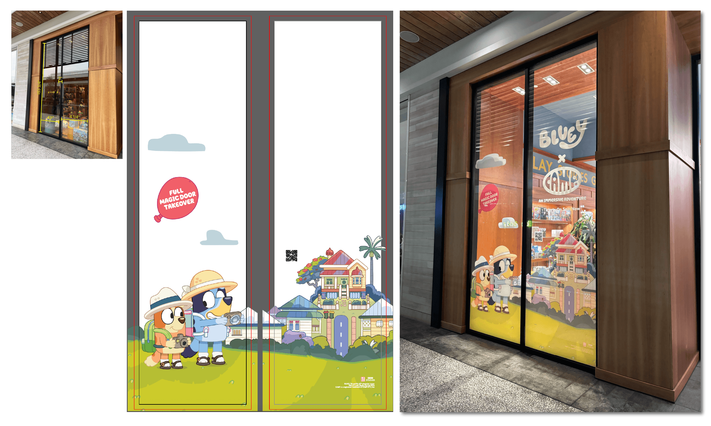
Vinyls were a little more complicated
Because I was creating at a large scale, I needed vector files that were color-coded correctly for print and would also fit perfectly in the front windows of our L.A. store. What that meant for me was recreating some of the assets that we only had available to us as raster into vector as well as going through and painstakingly checking every Pantone. In addition to that, I had to make sure the pieces I was recreating were extremely precise because they were branded, official assets. I was happy with the end-result (pictured below), though it took many hours of work and back-and-forth to get there.

